


*To facilitate the user experience, I have emboldened the "how" (methodology), and highlighted the "why" (reasoning / goal).
Project Overview
Software Tools
Figma, Miro
Duration
Aug - Oct 2022
My Role
UX / UI
Product Designer
Project Type
Google UX
course project
The Problem
Working adults, living alone or with families to feed, rarely find the time and energy to prepare healthy meals.
The Solution
Design an app with a variety of healthy menu options, so that fresh food gets delivered efficiently to users at their doorstep.
User Research + Pain Points
After conducting interviews and creating empathy maps, I found that the primary user base to cater to was working adults and parents with little time or energy to prepare healthy meals.
I also found other characteristics of some users who would prefer to use such an app, including foreigners with a language barrier who did not feel comfortable ordering in person. Some interested were those with visual impairments or hearing trouble as reading off a menu in a busy place was not suitable for them.
The research helped define the pain points of the users below:
Time; Busy users do not have time to plan meals, buy groceries, prep and cook the food everyday.
Energy; Many users are drained from work and want to maintain a healthy diet but need an easy way to feed their family.
Accessibility; Ordering on apps is a hassle for many, as they have very small fonts and button sizes.
3
1
2
User Personas
The research collected previously helped create user personas, which would be used later to lay the groundwork for the iterative process and help inform design decisions.

Maria Jacob
Age: 37
Education: M.A Psychology
Hometown: SF, USA
Family: partner, 2 children
Occupation: Therapist
I want only the best for my kids, so I try to go the extra mile in everything I do
Goals
-
Being able to do her job efficiently
-
Spending more time with friends and family
-
Staying healthy and providing nutritious meals for her kids
Frustrations
-
“Meal planning and prep takes up too much time”
-
“Apps do not offer healthy food options”
-
“Visual impairment causes eye strain”
worker bee; Work takes up most of her time. She constantly juggles between work and taking care of family. On weekends, she likes to spend time with friends. She has an active lifestyle and is very health conscious. Visual impairment makes it hard to use technology for long periods of time.

Chad Wellis
Age: 21
Education: uni, year 2
Hometown: Penang, MY
Family: 1 brother
Occupation: freelancer
I look forward to challenging myself and learning new things when possible
Goals
-
exploring different cultures and cuisines
-
Improving english language
-
Maintaining good work-life balance
Frustrations
-
“Most food delivery apps do not have option to switch language”
-
“Dining-in makes communication tough”
-
“Meal prep takes too long”
-
“Lack of variety in apps”
Foreign exchange student; A young adult who is eager to broaden his knowledge and create memories. He wants to learn and experience new cultures, especially through food. English is not his native language, but he tries to improve. Aims to balance studies with fun.
User Journey Map
By analyzing the personas and considering how the app may be used, I created a user journey map. This was done to see the improvement opportunies, aswell as adding a unique value proposition.
Persona: Maria
Goal: Find a quick and easy way to provide healthy meals for her family

Problem Statement + Ideation
The work done previously to empathize with the user helped to define the problem and come up with a problem statement for our persona;
'Maria is a working mom who needs a quick and healthy meal plan for her kids because she wants to encourage a healthy lifestyle while providing for her family'
For ideation, I used the "How might we" method to brainstorm ideas quickly for possible solutions to common user problems. The following questions were formed:
How might we
-
Provide access to healthy options for customers to improve user satisfaction?
-
Display nutritional content and meal pictures to better engage with the customers?
-
Create a system within the app so that users can navigate through pages with ease?
-
Refine the UI features for users to improve retention rate in the application?
-
Show meals based on popularity for users, to help them decide which dish to choose if they are unsure what to order?
Hand-drawn Wireframes
Drawing wireframes by hand allowed me to make rapid iterations and brainstorm many ideas with minimal effort.
Search Bar
Menu / meal carousels for easy navigation

main logo
Feature image with brief description
Bottom nav to switch b/w pages
Digital Wireframes and Prototyping

When converting hand-drawn screens to digital wireframes, I made use of Gestalt Principles in order to make the app easier to understand and navigate through.
Following the design, I turned the wireframes into a lo-fi prototype to conduct user testing and make it closer to the final result.
You can view the prototype here.
Usability Studies and Affinity Mapping
After the low fidelity prototype was made, I conducted the first round of testing through unmoderated usability studies with 5 participants. The findings from this research would then help to make iterations based on feedback.

Design iterations


The feedback obtained provided great insights as to what iterations could be made to improve the overall user experience.


Menu page altered
New screen
New screen
3/5 users had trouble finding address details while onboarding. An additional screen was made where details could be viewed or edited
All users had trouble navigating back and forth through the menus to select a dish. The layout was changed to show all the menus together.
4/5 participants were frustrated that they could not verify their details before the order was placed. A new screen was added for this purpose.
High Fidelity Mockups

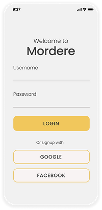


Accessibility Considerations
-
Dark mode, language switching, and text size increase options added in bottom nav menu, under the main pages.
-
Bold CTA buttons to draw emphasis, and consideration given to Gestalt principles for better UX.
-
Images for visually impaired users, supported with clearly legible text following WCAG standards.


Final Prototype
The clickable prototype has been provided here for an understanding of the app navigation;
-
The app here is just a demo version, so it has a few sample screens and not all the buttons can be clicked.
-
Click on the blue highlighted regions if you are unsure what to select.
-
The screen can be enlarged by pressing on the full screen icon at the top right corner the prototype.
Retrospective
What went well
Improvements to be made
-
Users enjoyed the look and feel of the app, as well as the value proposition features that made it stand out.
-
While starting the wireframes and prototypes was a daunting process, it become easier with the help of user feedback, testing and multiple iterations.
-
The app was generally well received and liked by users. One user exclaimed “I would love to see the finished product, and I’d definitely recommend it to friends!”
-
Include more screens, such as a help page, favourites, account details page and more.
-
With more time I would play around with interactions further and try to make it more engaging for a positive experience.
-
Idealistically, I would love to conduct a final round of testing before launching the product to ensure that the app has a smooth flow and all the problem areas have been addressed thoroughly.